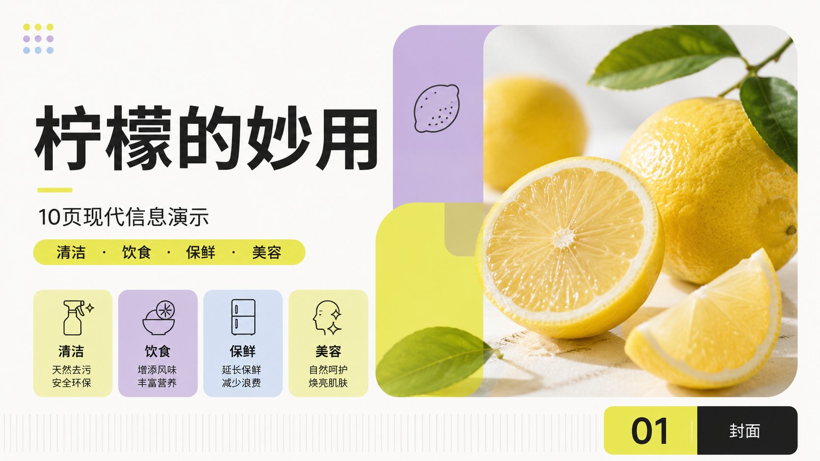
现代模块化国际主义柠檬主题PPT系统
Establish a bright, modular modern PPT visual system, with the International Typographic Style and modular grids as the main axis: use repeating units and stable baselines to unify the entire set of pages; use Gestalt's law of proximity and common regions to house similar information within rounded color blocks; use dynamic equilibrium to let large-area color fields, photos, and white space act as counterweights to each other in asymmetry; use editorial rhythm to form chapter breathing through changes in image scale, density, and white space. Draw on Josef Müller-Brockmann's precise column grids and objective hierarchy for alignment, Massimo Vignelli's use of limited typefaces and spread rules to maintain system consistency, Josef Albers' use of adjacent color fields to calibrate color perception, and Alexey Brodovitch's use of cropping, scale contrast, and white space to drive the dialogue between images and text; methods are synergistic but not mechanically replicated. Default to warm white #F7F7F3 as background at approx 45%, fluorescent yellow-green #E5EA45 as primary emphasis at approx 22%, light lavender purple #C5ADD7 as support at approx 18%, near black #1D1D1D for structure and body text at approx 12%, fog blue #AFC8EC for small amounts of information coding at approx 3%; control high-saturation colors to occupy only key areas based on Itten's light-dark and area contrast and Albers' adjacency effect. When users specify colors later, those shall prevail while retaining role hierarchy, area proportions, lightness differences, and projection readability. Adopt multi-column modular grids and ample margins, with titles, focal visuals, information cards, and annotations forming a clear first to third reading order; regular elements are strictly aligned, allowing only one rounded color field or focal visual to break the grid across columns, ensuring thumbnails are still recognizable at a glance. Background remains flat matte white, a mix of photography and geometric vectors: natural soft-light photos first undergo restrained color temperature unification, then are cropped with rounded hard-edge masks, overlaid with semi-transparent low-saturation color blocks, with a low-contrast isometric vertical line texture added at the bottom-most layer as a rhythmic band, avoiding meaningless shadows and decorative noise. Typefaces use consistent pairings of sans-serifs with the same skeleton, titles use medium-bold weights and tight line spacing to form large-scale jumps, and body text uses regular weights, wider line spacing, and short line lengths to ensure long-distance readability; Chinese and Western text are aligned by visual grayness rather than mechanical font size, unifying baselines, optically correcting kerning, and letting text edges share alignment lines with image masks. The overall presentation is rational, bright, friendly, agile, clear, and modern. Subject: The marvelous uses of lemons. Total of 10 slides.