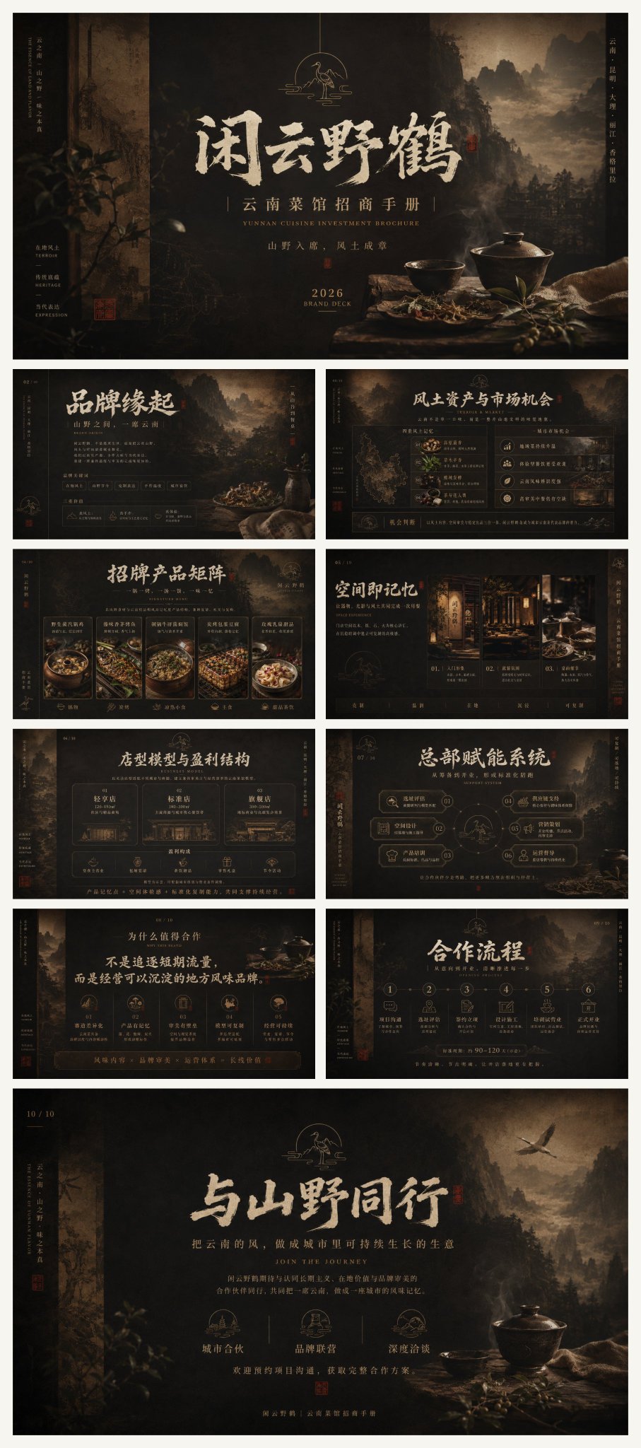
闲云野鹤云南菜馆招商手册设计视觉
Using the core theoretical system of traditional Chinese 'vivid rhythm and charm, treating white space as black, applying color according to categories, and the mutual generation of void and solid,' integrating Gestalt visual organization, Swiss International Style grids, the golden ratio, rhythm and repetition, figure-ground relationships, information hierarchy, and modular narrative in editorial design; assisted by Kenya Hara's white space and tactile paper feel, Alan Chan's modern translation of Eastern symbols, Kohei Sugiura's high-density information order, Zao Wou-ki's abstract charm, and Fan Kuan-style landscape spatial layering, restrained fusion rather than mechanical collage. The default color scheme adopts the imagery of Southern Yunnan soil and ancient wood: scorched tea, ochre, chestnut brown, smoke black, and rice xuan paper color, utilizing Munsell value layering, low-saturation analogous color harmony, subtle warm-cool differences, area contrast, and a 60/30/10 ratio, with local low-brightness red copper gold forming visual anchors; the overall style maintains a deep dark background, warm-toned subjects, soft highlights, low-contrast shadows, and a matte texture. The composition uses vertical axes, center focus, foreground-background layering, picture-in-picture depth, asymmetrical balance, and large areas of dark negative space, with the main subject establishing a solemn order through stable rectangular proportions, using baseline grids, multi-column headers, density contrast, scale jumps, and breathing spacing internally to form a reading rhythm from far to near, from static to intense. The background uses movie-level low-key lighting, Rembrandt side lighting, aerial perspective, shallow depth of field, soft focus vignettes, and local volumetric light to shape an immersive environment; visual materials use regional local documentary photography, natural texture macros, ancient rubbing techniques, xuan paper fiber scans, woodcut grain, film noise, silver halide fading, local scorched darkening, and layered mask fusion, strengthening the sense of time, craftsmanship, and local cultural thickness. The typography system uses a three-tier combination of calligraphy display fonts, modern Song typeface, narrow sans-serif, and small English caps; the main title integrates Wei Bei skeleton with cursive momentum, adding flying white, dry brush, ink smudge, edge fraying, misaligned overprinting, and slight embossed relief, the subtitle maintains thin Song high-contrast strokes, and the body text maintains professionalism with tight tracking and clear leading, with small amounts of vertical arrangement, seal-style frames, and matte gold stamping as cultural identification. The overall temperament is high-end, steady, primitive, moist, mysterious, restrained, heavy, elegant, local, credible, with a sense of brand epic, cultural collectibility, and commercial persuasiveness. Subject: Wild Crane (Xianyun Yehe), Yunnan Cuisine Restaurant, Investment Brochure. Ratio 16:9. Purpose: Investment brochure PPT images. A total of 10 images. You organize information freely, making people feel emotional fluctuations after reading, and gain something.